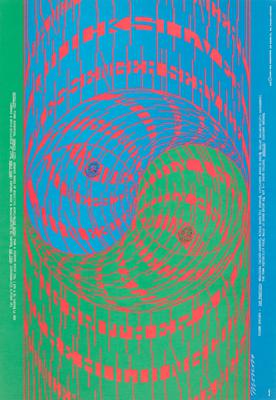
Swirly, The Doors, Miller Blues Band, Haji Baba, April 14-15, Avalon Ballroom
Victor Moscoso
1967
- Medium
- Color lithograph
- Dimensions
- 20 x 14 in. (50.8 x 35.56 cm) (sheet)
- Genre
Tags
United States
About
As a poster artist, Victor Moscoso rejected the conventions of his commercial art background where designs were uncomplicated and uniformly legible. Instead, Moscoso recalled his academic training under artist Josef Albers at the Cooper Union’s School of Art in New York City. There, Moscoso learned the basics of design and color theory, specifically that placing bright, contrasting colors (in this case, blue and green on magenta and pink) next to each other would create an illusion of pulsating motion along the edges. Together with Moscoso’s fluorescent color palette and nearly illegible lettering, this vibrating optical effect is a stylistic signature he considered the visual equivalent to the auditory overstimulation of a dance concert.